Art in adventures is useful for any number of reasons. I use art as reference: both visually ("oh, THAT'S what a Murrful Monster looks like!") and as a kind of shorthand bookmark in the adventure ("I know the Trash Beast encounter is after the four-armed Minotaur - that image is on page...17..."). Sometimes art really helps fill out the layout of the page. A good header or page border can make an adventure stand out in my mind - I'm thinking particularly of some of the old D&D adventures written in the UK - UK 5-7, B10, O2.
Mostly what I want from art is that it be evocative. I was leafing through The Gates of Firestorm Peak this morning. I've never played it - I didn't buy it back in the day. By the time it was published I was starting to get overwhelmed by the number of products TSR was putting out and I had discovered Magic: The Gathering (or, as my friend Jim used to call it, "Magic the Moneypit"). We weren't playing much D&D anymore anyway.
But I was looking through it today and several things about the art struck me:
First, the negative. I HATE watermark art on the page. There was a time when I thought it was kind of cool - but now I just find it distracting. It makes the pages just a bit harder to read - and heaven forbid you put italics over a watermark - my old eyes just aren't up to the struggle...
Second, the meh. Headers. I had forgotten how en vogue it became in second edition to use headers and page borders. The thing is, they aren't effective AT ALL. What the UK modules of the past did was a different header for each section (again, kind of a bookmark for where you are in the adventure) and had style. These are just the same two images repeated ad nauseum... I wouldn't mind if it wasn't just kind of page filler - add six more lines of text to each column, please... |
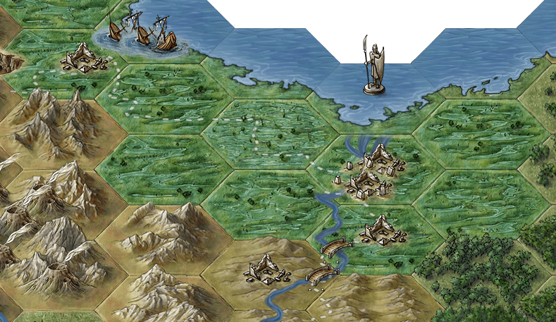
| Where is this? |
Finally, the evocative! I like a lot of the art in this adventure - it really helps set the mood for me. "Giants" staring over a gate, huge skeletons, weird tentacled things and mutated trolls. Good stuff. In the "really helping me get it" mode, there's a creepy fountain and a crystal room with a bizarre hanging quicksilver pool (which I totally didn't understand until I saw the pic) - heck even the myconid image is evocative (huddled in a group but, to me, still defiant and aloof...).
Here's a couple images (full pagers) that help sell the scenes for me - where a picture really does say a thousand words:


.jpg)


.jpg)


.png)


.jpg)


.JPG)


No comments:
Post a Comment